|
|
| Line 692: |
Line 692: |
| | === Gold Plated === | | === Gold Plated === |
| | | | |
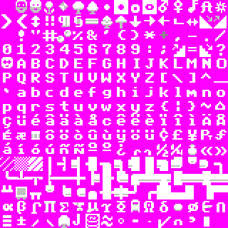
| − | [[Image:Gold_Plated_preview.png|thumb|right|Presentation of Gold Plated]] | + | [[Image:Gold_Plated_preview.png|thumb|right|Presentation of Gold Plated (v.1)]] |
| − | [[Image:Gold_Plated_text_preview.png|thumb|right|Text preview]] | + | [[Image:Gold_Plated_text_preview.png|thumb|right|Text preview(v.1)]] |
| − | [[Image:Gold_Plated_world_preview.png|thumb|right|WorldGen preview]]
| |
| | {{Tileset| | | {{Tileset| |
| − | |image=[[Image:Gold_plated_16x16.png]] | + | |image=[[Image:Gold_plated_16x16_v2.png]] |
| | |author=[[User:DrD_AVEL|DrD_AVEL]] | | |author=[[User:DrD_AVEL|DrD_AVEL]] |
| − | |dated=2010-02-12 | + | |dated=2010-Mar-13 |
| | |size=16×16 | | |size=16×16 |
| | |resolution=1280×400 native. | | |resolution=1280×400 native. |
| − | |comments=This tileset contains the best graphic tiles (in my opinion) that were collected from many other tilesets and other games; I took [[User:Lemunde|Lemunde's]] tileset as a basis (thanx a lot, Lemunde). Some of tiles were drawn by me. Many tiles were reworked and improved with some additional colours. I hope you enjoy with this tiles. ;) | + | |comments=Gold Plated is updated to v2.0. Improvements complete. Some tiles were redrawn and corrected. |
| | + | This tileset contains the best graphic tiles (in my opinion) that were collected from many other tilesets and other games; I took [[User:Lemunde|Lemunde's]] tileset as a basis (thanx a lot, Lemunde). Some of tiles were drawn by me. Many tiles were reworked and improved with some additional colours. I hope you enjoy with this tiles. ;) |
| | [[http://www.bay12games.com/forum/index.php?topic=49479.0 Discussion of this tileset is here]] | | [[http://www.bay12games.com/forum/index.php?topic=49479.0 Discussion of this tileset is here]] |
| | }} | | }} |
Revision as of 06:36, 13 March 2010
You may be looking for general information on tilesets or the Graphics set repository.
Square tilesets
These are all the character sets with square tiles, except for the character sets with 16×16 tiles. Those are listed below. Text in square tilesets (as opposed to tilesets with shorter width) is usually more difficult to read, but the map is not distorted.
Anikki
|
| Title
|
[[#{{{filename}}}|{{{filename}}}]]
|
| Author
|
Anikki
|
| Dated
|
2008-7-27
|
| Tile Size
|
8×8
|
| Resolution
|
640×200 native.
|
| Versions
|
|
| Comments
|
Based on the original IBM CGA Character set with a lot of tweaks. The characters remain as descriptive yet universal as possible. I chose the CGA set because it is in my opinion the square set with the best readability. This set is for those who like the basic ASCII look where every pixel has meaning or (multiple meanings). Download the BMP
There is also an upscaled 16x16 version of this set available for fullscreen use below.
|
|
|
|
| Title
|
[[#{{{filename}}}|{{{filename}}}]]
|
| Author
|
Anikki
|
| Dated
|
2008-7-27
|
| Tile Size
|
10×10
|
| Resolution
|
800×250 native.
|
| Versions
|
|
| Comments
|
Based primarily on Tocky and Plac1d's sets (which are brilliant). The characters remain as descriptive as possible with some tweaks to the font for better readability and some changes to symbols for more consistency. This set is for those who like the basic ASCII look where every pixel has meaning or (multiple meanings). Download the BMP
(Note: The up and down ramps are reversed.)
|
|
|
|
| Title
|
[[#{{{filename}}}|{{{filename}}}]]
|
| Author
|
Anikki
|
| Dated
|
2008-7-27
|
| Tile Size
|
20×20
|
| Resolution
|
1600×500 native.
|
| Versions
|
|
| Comments
|
Based primarily on Tocky and Plac1d. This is a scaled up version of the 10x10 tileset for fullscreen use. Download the BMP
(Note: The up and down ramps are reversed.)
|
|
|
Bisasam
|
| Title
|
[[#{{{filename}}}|{{{filename}}}]]
|
| Author
|
Bisasam
|
| Dated
|
2010-01-01
|
| Tile Size
|
24×24
|
| Resolution
|
1920×600 (80x25 grid size); 1920×1200 (80x50 grid size)
|
| Versions
|
|
| Comments
|
Inspired by the Terminus24 tileset, I created this square 24x24 tileset. Almost all symbols have been redrawn antialiased; so DF 40d16 (0.28.181.40d16) must be used. Note that most symbols are white and the background is transparent, which makes it hard to discern anything in the PNG. In order to use unscaled tiles, horizontal resolution must be at least 1920.
|
|
|
Dorten
|
| Title
|
[[#{{{filename}}}|{{{filename}}}]]
|
| Author
|
Dorten
|
| Dated
|
2009-2-13
|
| Tile Size
|
9×9
|
| Resolution
|
720×225
|
| Versions
|
|
| Comments
|
It's improved Savok's tileset, which is changed to make walls look smooth. Plus another little differences.
|
|
|
|
| Title
|
[[#{{{filename}}}|{{{filename}}}]]
|
| Author
|
Dorten
|
| Dated
|
2009-2-13
|
| Tile Size
|
9×9
|
| Resolution
|
720×225
|
| Versions
|
|
| Comments
|
Minor tweak so the 7's don't look like question marks.
|
|
|
Gekz
|
| Title
|
[[#{{{filename}}}|{{{filename}}}]]
|
| Author
|
Gekz
|
| Dated
|
2010-1-08
|
| Tile Size
|
11×11
|
| Resolution
|
880×275
|
| Versions
|
|
| Comments
|
This works great on my EeePCs shoddy resolution of 1024x600, and this is why I made it. This is basically the Terminus font converted for use on DF. I chose this font due to its readability at a low resolutions, and soon I'll convert some of the non-letter characters into actually objects like beds and dwarves, so keep a look out for an updated version that I'll add below.
This forum thread has the slightly 'graphical' test version. Quite amusing. Check there for updates.
|
|
|
Hanuman
|
| Title
|
[[#{{{filename}}}|{{{filename}}}]]
|
| Author
|
Hanuman
|
| Dated
|
2008-7-23
|
| Tile Size
|
12×12
|
| Resolution
|
900×300
|
| Versions
|
|
| Comments
|
This is basically the curses_800x600.bmp file converted to 12x12. It may be slightly different but it is close enough for me. Get the .BMP here.
Note: If the tileset doesn't look right played at 900x300, try changing the resolution to 966x325.
|
|
|
Haowan
|
| Title
|
[[#{{{filename}}}|{{{filename}}}]]
|
| Author
|
Haowan
|
| Dated
|
2007-11-2
|
| Tile Size
|
18×18
|
| Resolution
|
1440×450
|
| Versions
|
|
| Comments
|
An enlarged version of a square version of the default set.
|
|
|
Herrbdog
|
| Title
|
[[#{{{filename}}}|{{{filename}}}]]
|
| Author
|
Herrbdog
|
| Dated
|
2007-10-30
|
| Tile Size
|
12×12
|
| Resolution
|
960×300
|
| Versions
|
|
| Comments
|
A larger version of this tileset is available below.
|
|
|
Lord Dullard
|
| Title
|
[[#{{{filename}}}|{{{filename}}}]]
|
| Author
|
Lord Dullard/Exponent
|
| Dated
|
2009-3-30
|
| Tile Size
|
12×12
|
| Resolution
|
960×300 native
|
| Versions
|
|
| Comments
|
Adjusted by Exponent, and with new dwarf characters added. A version of the Unknown 12×12 tileset with smoothed walls. Example: Wiltedblight.
|
|
|
Lord Nightmare
|
| Title
|
[[#{{{filename}}}|{{{filename}}}]]
|
| Author
|
Lord Nightmare/IBM
|
| Dated
|
2007-10-30
|
| Tile Size
|
8×8
|
| Resolution
|
640×400
|
| Versions
|
|
| Comments
|
The original IBM CGA Character set, thick variant, dumped from addresses 0x1800-0x1fff the 5788005 IBM Character Generator ROM. This is the far more common 'thick' variant. Best viewed at 8:5 aspect ratio.
|
|
|
Lord Nightmare's 8×8 CGA tileset
|
| Title
|
[[#{{{filename}}}|{{{filename}}}]]
|
| Author
|
Lord Nightmare/IBM
|
| Dated
|
2008-6-6
|
| Tile Size
|
8×8
|
| Resolution
|
640×400
|
| Versions
|
|
| Comments
|
The original IBM CGA Character set, thin variant, dumped from addresses 0x1000-0x17ff the 5788005 IBM Character Generator ROM. This is the less common 'thin' variant, which required soldering on two pins and jumpering them on the CGA card to use. Best viewed at 8:5 aspect ratio.
|
|
|
|
| Title
|
[[#{{{filename}}}|{{{filename}}}]]
|
| Author
|
Lord Nightmare/IBM
|
| Dated
|
2007-10-30
|
| Tile Size
|
8×8
|
| Resolution
|
640×400
|
| Versions
|
|
| Comments
|
The IBM EGA 8×8 Character set, dumped from the 6277356 IBM EGA BIOS ROM. This is ALMOST 100% IDENTICAL to the CGA thick font, but has minor modifications (23 pixels total) done to four characters: the capital 'S', the club sign, the spade sign, and the large asterisk (the one with a hole in the middle, char 0x0f, not the shift-8 one which is char 0x2a). There is no thin variant of this font. Best viewed at 8:5 aspect ratio.
|
|
|
Maus
|
| Title
|
[[#{{{filename}}}|{{{filename}}}]]
|
| Author
|
maus
|
| Dated
|
2007-10-30
|
| Tile Size
|
9×9
|
| Resolution
|
720×225
|
| Versions
|
|
| Comments
|
Another square tileset that's usable on low resolutions, modeled after a common font used on the Nintendo Entertainment System. An 18x18 version for 1440x450 resolution is also available here, and is really nice on a widescreen monitor. An NES palette is available here.
|
|
|
Markavian
|
| Title
|
[[#{{{filename}}}|{{{filename}}}]]
|
| Author
|
Markavian
|
| Dated
|
2007-12-4
|
| Tile Size
|
12×12
|
| Resolution
|
960×300
|
| Versions
|
|
| Comments
|
This revision is designed to work with DF version 0.27.169.33a with special tiles for stairs and ramps, as well as the changes present in the earlier version such as bones, walls, trees and swords.
Available in mkv curses 12×12 and 6x6 v2.zip. As seen in the fortress of Axegear.
|
|
|
|
| Title
|
[[#{{{filename}}}|{{{filename}}}]]
|
| Author
|
Markavian
|
| Dated
|
2007-10-30
|
| Tile Size
|
12×12
|
| Resolution
|
960×300
|
| Versions
|
|
| Comments
|
An older revision of my square tileset, featuring more detailed symbols, with alterations to certain text characters to look more like ingame items. The walls are infilled now.
Available in mkv curses 12×12 and 6x6 v2.zip. As seen in the fortress of Inkflew.
|
|
|
Paul
|
| Title
|
[[#{{{filename}}}|{{{filename}}}]]
|
| Author
|
Paul
|
| Dated
|
2008-9-5
|
| Tile Size
|
10×10
|
| Resolution
|
800×250 for 80×25 grid size, others just multiply grid by 10.
|
| Versions
|
|
| Comments
|
Custom tileset I made for my own use when the adjustable grid sizes were released for DF. Some accented letters cut slightly to allow for larger letter display. Contains several of Tocky's tiles (barrels, some trees, dimple cups, coins, slightly modified armor stand). Others are either made by me or adjusted from curses_800x600 tiles.
|
|
|
Savok
Savok's tiny, non-updated tileset
|
| Title
|
[[#{{{filename}}}|{{{filename}}}]]
|
| Author
|
Savok
|
| Dated
|
2007-10-30
|
| Tile Size
|
9×9
|
| Resolution
|
720×225
|
| Versions
|
|
| Comments
|
There is no doubt that this tileset is old. This must be distinctly understood if anything wonderful is to come of your use of it. You may like Dorten's revision more. The following is the original description:
I dislike curses_640x300.bmp due to its lack of any kind of graphics for things like a bed or a barrel and the fact that it distorts my beautiful circles, so I made a similarish tileset to fix those.
|
|
|
Sir Henry
|
| Title
|
[[#{{{filename}}}|{{{filename}}}]]
|
| Author
|
Sir Henry
|
| Dated
|
2009-8-19
|
| Tile Size
|
32×32
|
| Resolution
|
2560×800
|
| Versions
|
|
| Comments
|
Recently I learned of a monitor displaying 2560 pixels horizontally, and I decided it needed a tileset to put to use. Taking the tileset I use (Kelora 16x16 diagonal) and doubling it, I was able to get a decent tileset. Smoothing the edges, and redoing some glyphs to get a better look (or just messing up some to bad to fix), I was able to achieve this.
|
|
|
Teeto_K
|
| Title
|
[[#{{{filename}}}|{{{filename}}}]]
|
| Author
|
Teeto_K
|
| Dated
|
2008-10-24
|
| Tile Size
|
18×18
|
| Resolution
|
1440×450
|
| Versions
|
|
| Comments
|
A tileset based on Maus's 18x18 version of his "Nostalgia" tileset, however, it has been heavily revised. The entire font has been "smoothed over", and many of the symbols changed to more "graphical" representations of the items they represent. An attempt to fill the void of "graphic heavy" tilesets in the 18x18 tile-size. A special emphasis is placed on maximizing the text's readability, while still providing a "graphics enhanced" play area. Special thanks to Maus for the font, and Guybrush for the inspiration.
|
|
|
Terbert
|
| Title
|
[[#{{{filename}}}|{{{filename}}}]]
|
| Author
|
Terbert
|
| Dated
|
2009-6-30
|
| Tile Size
|
10×10
|
| Resolution
|
800×250
|
| Versions
|
|
| Comments
|
This is Terbert's First tileset
|
|
|
Tocky
|
| Title
|
[[#{{{filename}}}|{{{filename}}}]]
|
| Author
|
Tocky
|
| Dated
|
2007-11-15
|
| Tile Size
|
10×10
|
| Resolution
|
800×250 native, 800×500 for fullscreen.
|
| Versions
|
|
| Comments
|
I tried to make all the pictographic symbols as descriptive as possible: the only ones I've spotted that show up in odd places are the staircase symbols, '<' and '>', which are used as tags on barrel descriptions, and don't match -- but I'm willing to live with that in order to be able to tell up-stairs from down- ones. With everything else, I just tried to maximize clarity and readability and to keep them consistent. I'm really very pleased with how this set turned out.
|
|
|
Turnip
|
| Title
|
[[#{{{filename}}}|{{{filename}}}]]
|
| Author
|
Turnip
|
| Dated
|
2009-7-9
|
| Tile Size
|
12×12
|
| Resolution
|
960×300
|
| Versions
|
|
| Comments
|
My revision of Markavian's tileset, made to be more "curvy"
|
|
|
Unknown
|
| Title
|
[[#{{{filename}}}|{{{filename}}}]]
|
| Author
|
Unknown
|
| Dated
|
2007-10-30
|
| Tile Size
|
12×12
|
| Resolution
|
960×300
|
| Versions
|
|
| Comments
|
This is a tileset submitted by an unknown user from the IP address 86.43.81.125.
|
|
|
|
| Title
|
[[#{{{filename}}}|{{{filename}}}]]
|
| Author
|
Unknown
|
| Dated
|
2007-11-24
|
| Tile Size
|
12×12
|
| Resolution
|
960×300
|
| Versions
|
|
| Comments
|
This is very similar to the above tileset, but has some noticeable differences. I have no idea where I got it from. It's great on a 1024x768 CRT monitor in windowed mode. I use it in a 1000x500 window with [BLACKSPACE:YES]. --JT
|
|
|
Xenomorph
|
| Title
|
[[#{{{filename}}}|{{{filename}}}]]
|
| Author
|
Xenomorph
|
| Dated
|
2008-8-9
|
| Tile Size
|
8×8
|
| Resolution
|
640×200
|
| Versions
|
|
| Comments
|
This is the tileset used by Acorn computers, starting with the BBC Micro. This version is as it would have appeared in 40-column modes (and shuffled a little to adapt it to CP437). It also looks nice at double resolution. Download the BMP.
|
|
|
Yayo
|
| Title
|
[[#{{{filename}}}|{{{filename}}}]]
|
| Author
|
Yayo
|
| Dated
|
2007-10-30
|
| Tile Size
|
8×8
|
| Resolution
|
640×200
|
| Versions
|
|
| Comments
|
Name: Yayo's C64; Based on the charset of the commodore 64. It's a flat style, but it's clean and also highly readable. I recreated all the missing chars like letters with accents and symbols, trying to get a c64 style as much as possible. If it's too small, use the 16×16 version below. :)
|
|
|
|
| Title
|
[[#{{{filename}}}|{{{filename}}}]]
|
| Author
|
Yayo
|
| Dated
|
2007-10-30
|
| Tile Size
|
13×13
|
| Resolution
|
1040×325
|
| Versions
|
|
| Comments
|
Name: Yayo's Tunur; According to the language files of DF, Tunur means "style" in dwarf language. It may require a bit to get used to some symbols, but it's a very clean tileset. (It's just a bit weird. :P)
|
|
|
|
| Title
|
[[#{{{filename}}}|{{{filename}}}]]
|
| Author
|
Yayo
|
| Dated
|
2009-09-12
|
| Tile Size
|
20×20
|
| Resolution
|
1920×1200
|
| Versions
|
|
| Comments
|
Name: Yayo's Oreslam; Just like the previous one, this tileset is named according to the dwarf language: or-es-lam means "Large Clear Stone". I decided to create this tileset to fit my usual screen resolution (1920x1200). I tried giving it a clean look. To use it in windowed mode try these settings in the init file: WINDOWEDX:1900, WINDOWEDY:1160, GRID:95:58.
|
|
|
Zaratustra
|
| Title
|
[[#{{{filename}}}|{{{filename}}}]]
|
| Author
|
Zaratustra
|
| Dated
|
2007-10-30
|
| Tile Size
|
8×8
|
| Resolution
|
640×200 or 640×400
|
| Versions
|
|
| Comments
|
The MSX and MSX2 font, shuffled around to fit the char set. Double lines were added.
|
|
|
16×16 tilesets
The 16×16 tilesets are a subset of square character sets. 16×16 is a frequently used size, as shown by the number of tilesets in this section. This is probably because all of the best creature graphics sets use 16×16 tiles. Those alternate sets for creatures can be found at graphics sets. If your screen is too small for these, turn on BLACK_SPACE!
Aesomatica
|
| Title
|
[[#{{{filename}}}|{{{filename}}}]]
|
| Author
|
Aesomatica
|
| Dated
|
2008-11-29
|
| Tile Size
|
16×16
|
| Resolution
|
1280×400 native.
|
| Versions
|
|
| Comments
|
Tileset intended to build upon Sphr's and Jackard's work, as well as others. Some tiles are original, some are variants and most are copied from various sets the author found pleasing. Notable originals include the broken bolt/ashes tiles, the ballista heads/large hills, the small hills, the ore (gear animation is pleasing, though axle animation is unimproved), ground tiles, and vermin. Also, bins look decent and up/down stairs look okay. This set looks its best with Sphr's graphics.
|
|
|
Anikki
|
| Title
|
[[#{{{filename}}}|{{{filename}}}]]
|
| Author
|
Anikki
|
| Dated
|
2008-7-27
|
| Tile Size
|
16×16
|
| Resolution
|
1280×400 native.
|
| Versions
|
|
| Comments
|
Based on the original IBM CGA Character set with a lot of tweaks. The characters remain as descriptive yet universal as possible. I chose the CGA set because it is in my opinion the suqare set with the best readability. This set is for those who like the basic ASCII look where every pixel has meaning or (multiple meanings). This is a scaled up version for fullscreen use. Download the BMP
|
|
|
Bisasam
|
| Title
|
[[#{{{filename}}}|{{{filename}}}]]
|
| Author
|
Bisasam
|
| Dated
|
2010-01-11
|
| Tile Size
|
16×16
|
| Resolution
|
1280×400
|
| Versions
|
|
| Comments
|
This is the 16x16 version of my 24x24 tileset. DF 40d16 (0.28.181.40d16) must be used. Note that most symbols are white and the background is transparent, which makes it hard to discern anything in the PNG. In order to use unscaled tiles, horizontal resolution must be at least 1280.
|
|
|
Cooz
|
| Title
|
[[#{{{filename}}}|{{{filename}}}]]
|
| Author
|
Cooz
|
| Dated
|
2009-2-28
|
| Tile Size
|
16×16
|
| Resolution
|
1280×400 native.
|
| Versions
|
|
| Comments
|
v1.1 - 3px wide walls and some other tweaks. Based on Klokjammer and Marble Dice tilesets. Some tiles were taken from other sets, some were made from scratch. The aim was to keep feel of default curses font in 16×16 tileset. There's also version without shading.
|
|
|
Guybrush
|
| Title
|
[[#{{{filename}}}|{{{filename}}}]]
|
| Author
|
Guybrush
|
| Dated
|
2007-11-15
|
| Tile Size
|
16×16
|
| Resolution
|
1280×400
|
| Versions
|
|
| Comments
|
A 16×16 tileset based on the very nice Herrbdog's one, and for use with the superb Dystopian Rhetoric objects. A slightly modified version of Herrbdog's tileset is available below if you want to keep the original ASCII symbols for some objects (just do some cut & paste). It's just a little brighter and with some very slight changes. The tileset shown is a tileset with graphic objects added, for use with Fortress Mode.
I recommend to have a look at the color schemes page to find your favorite color settings. The color scheme I used for the screenshots is this one.
|
|
|
|
| Title
|
[[#{{{filename}}}|{{{filename}}}]]
|
| Author
|
Herrbdog, modified by Guybrush
|
| Dated
|
2007-10-30
|
| Tile Size
|
16×16
|
| Resolution
|
1280×400
|
| Versions
|
|
| Comments
|
Here is the slightly modified version of Herrbdog's tileset which still has all the ASCII characters intact
|
|
|
Herrbdog
Inquisitor Saturn
|
| Title
|
[[#{{{filename}}}|{{{filename}}}]]
|
| Author
|
Inquisitor Saturn
|
| Dated
|
2008-5-18
|
| Tile Size
|
16×16
|
| Resolution
|
1280×400
|
| Versions
|
|
| Comments
|
Another 16 by 16 tileset. This one is notable because of the subtle shadowing and a completely original, hand-made font.
|
|
|
Kaishaku
|
| Title
|
[[#{{{filename}}}|{{{filename}}}]]
|
| Author
|
Kaishaku
|
| Dated
|
2007-10-30
|
| Tile Size
|
16×16
|
| Resolution
|
1280×400
|
| Versions
|
|
| Comments
|
A square 1280×400 font. Simple and legible. Converted from roarl's 16×16 nethack font, on top of super foul egg's template, extended manually and with ideas from lucida console. This is version 1, created in one morning. Screenshots available here.
|
|
|
Kelora
|
| Title
|
[[#{{{filename}}}|{{{filename}}}]]
|
| Author
|
Kelora
|
| Dated
|
2009-7-26
|
| Tile Size
|
16×16
|
| Resolution
|
|
| Versions
|
|
| Comments
|
A square tileset using the diagonal wall concept from Belal and others but simplified drastically to improve the appearance. All the walls line up correctly and have consistent widths.
I did not use much of the pretty but confusing art I see in many of the other sets. I tried for a while to incorporate many of these but found that with the multiple uses for most characters they were just wrong far too often to be useful. The only ones that seem to work are the dwarves which I took from Flying Mage / Guybrush. The pretty 3Dish fonts as well just seem to look muddier and be less legible. I love it and my husband has been happily playing it for months.
|
|
|
Klokjammer
|
| Title
|
[[#{{{filename}}}|{{{filename}}}]]
|
| Author
|
Klokjammer
|
| Dated
|
2007-10-30
|
| Tile Size
|
16×16
|
| Resolution
|
1280×400
|
| Versions
|
|
| Comments
|
Name: "Masked Adventurer" - after tile (0,4), where '@' used to be. A somewhat abstract version of the original curses square tileset, but with the alpha numeric characters shaped so as not to look distorted. Other symbols are either borrowed from or improved from curses, and some (including the dwarves) were created from the ground up. Alternate variations, are available here.
|
|
|
|
| Title
|
[[#{{{filename}}}|{{{filename}}}]]
|
| Author
|
Klokjammer
|
| Dated
|
2007-10-31
|
| Tile Size
|
16×16
|
| Resolution
|
1280×400
|
| Versions
|
|
| Comments
|
A "clean" version of the above set, one without any fancy tiles (except for the dwarves).
|
|
|
Marble Dice
|
| Title
|
[[#{{{filename}}}|{{{filename}}}]]
|
| Author
|
Marble Dice
|
| Dated
|
2007-10-30
|
| Tile Size
|
16×16
|
| Resolution
|
1280×400
|
| Versions
|
|
| Comments
|
This tileset attempts to modify the size and aspect ratio of the classic 8x12 terminal/curses font employed by many rougelikes without sacrificing the distinctive character.
|
|
|
Nordic Curses
|
| Title
|
[[#{{{filename}}}|{{{filename}}}]]
|
| Author
|
Techhead
|
| Dated
|
2009-3-26
|
| Tile Size
|
16×16
|
| Resolution
|
1280×400
|
| Versions
|
|
| Comments
|
My first attempt at a unique curses-style tileset with a Nordic Theme. Some characters have been altered.
|
|
|
PTTG
|
| Title
|
[[#{{{filename}}}|{{{filename}}}]]
|
| Author
|
PTTG
|
| Dated
|
2007-11-21
|
| Tile Size
|
16×16
|
| Resolution
|
1280×400
|
| Versions
|
|
| Comments
|
A new version! Clean, sharp, and clear. All-original, and large size for big screens! Also features coloured indicators for levers, helping to remove the guesswork. It is good stand-alone, or with my graphics set.
|
|
|
Random832
|
| Title
|
[[#{{{filename}}}|{{{filename}}}]]
|
| Author
|
User:Random832
|
| Dated
|
2009-4-22
|
| Tile Size
|
16×16
|
| Resolution
|
1280×800 etc
|
| Versions
|
|
| Comments
|
Based on the MS ゴシック (MS Gothic) japanese font, with some gaps filled in from the VGA 8x16 font, and some other characters tweaked by hand.
|
|
|
Red Jack


